Getting to know Claire!
Sunday, December 8, 2013
Final Project: Corporate Identity
For my fictional company, I decided to create a bakery called Claire's Cookie Jar which makes a bakes a wide variety of specialty cookies and also offers catering to special events. For my brochure, letterhead, and business card, I included both the logo from my company along with a similar layout with pink and brown stripes throughout all three pieces. I chose to use these colors since they go well together and create a "friendly" feel. I also used to the same font in all three pieces to create a sense of unity between them. In my brochure, I included information about the company along with the prices and kinds of cookies that we bake. I used a friendly tone while writing about the company to let my customers know that my bakery is a place that is welcoming and a friendly environment for all ages. The company's contact information can be found on all three pieces. My personal information is found on my business card as well. I enjoyed this project very much and I learned a lot about Adobe inDesign and illustrator while working on my project. Overall, I am very happy with how my project came out.
Monday, November 25, 2013
Sunday, November 17, 2013
Corporate Identity Questionnaire
1) What is your business?
We are a bakery that specifically makes cookies.
2) Describe your business in one sentence
We bake a large variety of delicious cookies to satisfies any age's sweet tooth.
3) Who is your target audience?
Children, young adults.
4) Who are your competitors?
Mrs.Field's cookies, Girl Scout's Cookies
5) What makes them better/worse than your product/service?
Girl's Scouts cookies is selling cookies for a good cause, although none of their cookies are homemade or freshly baked. Mrs.Field's cookies does make homemade cookies, but they are not as unique as Claire's Cookie Jar.
6) Do you currently have an identity? (This is more for companies that are already established and you’re just revamping the logo/corporate identity. If you have a new company or product, skip this question.)
7) (If your answer to #6 is no, skip this question) What do you like about it and what don’t you like about it?
These following questions might seem silly, but their purpose is to help generate ideas.
1) How do you want your image to be seen in two years?
I would like it to be a well-known name around the country where people go to enjoy a sweet treat and enjoy time with friends.
2) If your company was an animal, what animal would it be and why?
My company would be a dog because dog's are extremely friendly, love meeting new people, and of course they love treats!
3) If your company/brand was a person, who would it be and why?
Buddy Valastro, he is a famous cake baker on the show Cake Boss. He would make my companies cookies irresistible!
4) If your company/brand was an object, what would it be?
A cookie jar.
5) If your customer was a cartoon character, who would it be?
The Cookie Monster.
Tuesday, November 12, 2013
Lyrical Collage
When we were first assigned this project, I immediately knew that I wanted to create a collage for my best friend Shawn that passed away in the summer of 2012. The quote that I based my project on is "May Angels Lead You In", a song written by the band Jimmy Eat World. I decided to create a collage taking place in heaven and showing Shawn as an angel. I used an image from google with a staircase in the clouds as the background. I then inserted an open door at the top of the staircase to represent the "door to heaven". For the wings and birds, I downloaded brushes off of the internet and adjusted them levels and color adjustments. I created a rainbow going across the image using a rainbow gradient and then adding a gaussian blur to it. I enjoyed doing this assignment but I still find photoshop to be more difficult to use than illustrator.
Reference Images
Sunday, November 3, 2013
Custom Graphic
I chose to make an abstract image for this assignment. I used a pre-made image of the moon from the internet for the base of my picture. I then inserted more stars into the background using a brush that looked similar to stars to make them more noticeable. For the smoke or flame like clouds coming out of the moon, I downloaded abstract flame brushes from the internet and uploaded them as new brushes. I applied a gausian blur to the make them feel more "cloud-like".
Tuesday, October 29, 2013
Self Insertion
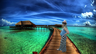
I chose to insert myself into a picture on a beach in a tropical place because my favorite place to go is the beach. I used the magnetic lasso tool to crop around my background. I then inserted myself into the picture. I adjusted the colors slightly only on my body to match the background and give it a "cooler" feel since the background consists of blue and green colors.
Subscribe to:
Comments (Atom)


